
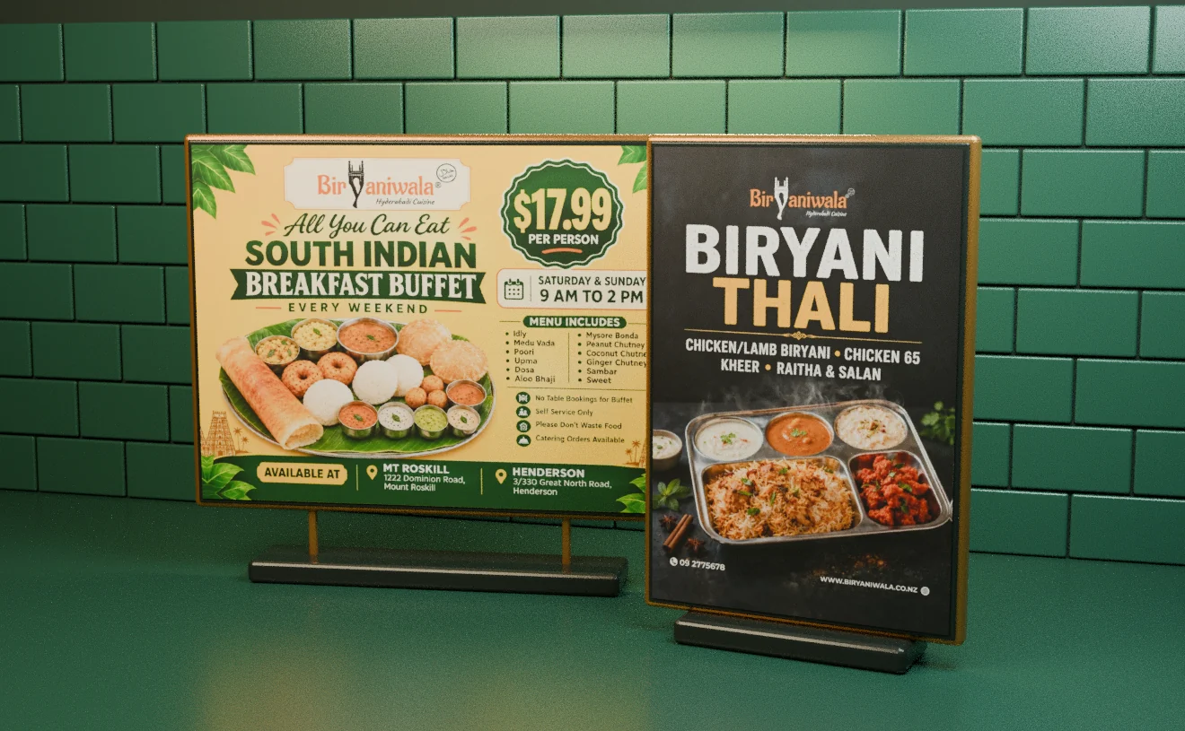
Restaurant campaign and poster design case study, Auckland Biryaniwala.
Making a changing menu of offers easy to recognise across Auckland restaurants.
The problem
Offer, food, time, price and branch all compete for one glance.
The approach
Set the reading order before designing the layout.
The result
A family of posters in several print sizes, updated as offers changed.
The challenge
Someone walking past a restaurant has a moment to decide whether an offer is for them. The offer, the food, the time, the price and the participating branch all compete for that moment, and the offers change regularly.
What I did
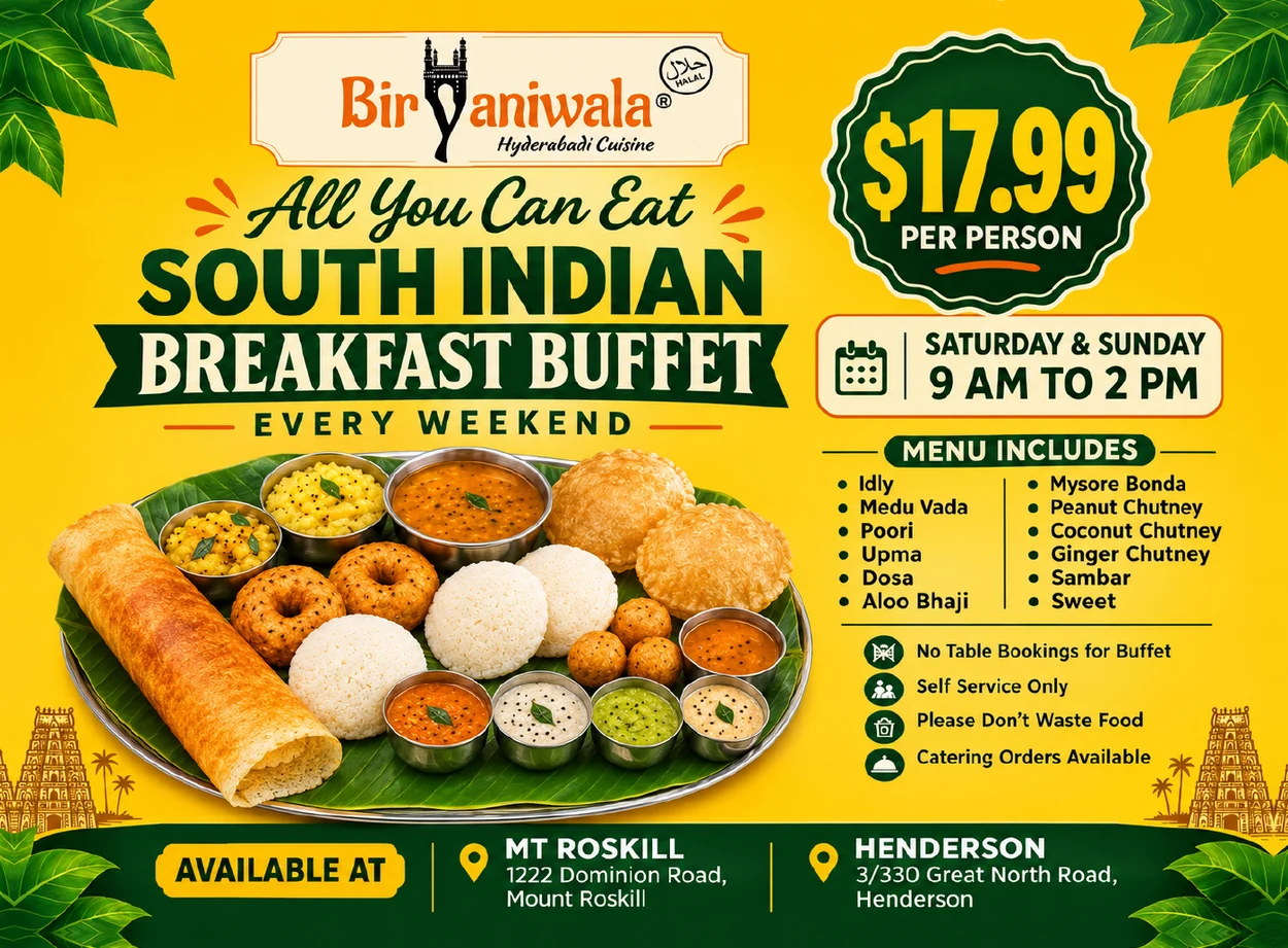
For the breakfast buffet, the offer and the price get the strongest type. The weekend hours and branches sit in their own blocks, so they can be found without competing. For the biryani thali, the photograph does more of the talking. The restaurant mark and a consistent type hierarchy hold both campaigns together.
The decision that shaped it
Decide what a passer-by reads first. Then design the poster.
Every poster starts as a ranked list: what must be read in one second, in three seconds and only by someone who stops. The layout follows that list, which also made new offers faster to produce.
What shipped
A landscape South Indian breakfast buffet poster and a portrait biryani thali promotion, with artwork prepared for different print sizes and adjusted as the offers changed.
Reading order
Four things, one glance.
Step through the breakfast buffet poster in the order a passer-by reads it.
The work, up close.
Open full size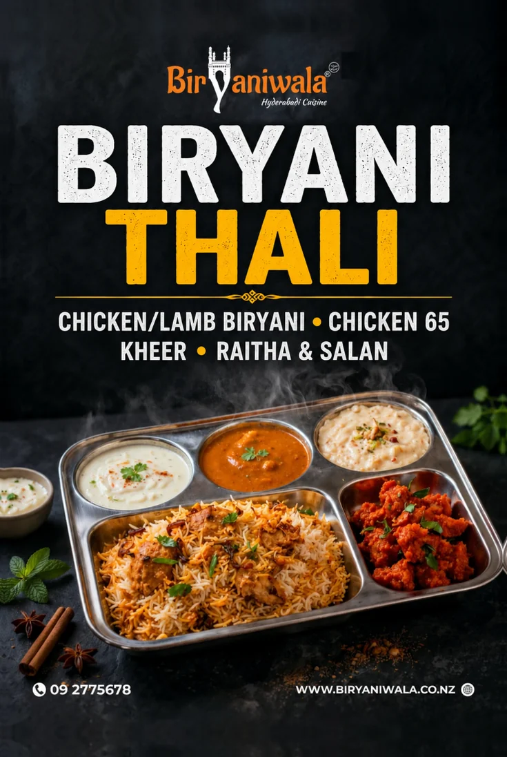 Open full size