Personal brand and monogram design case study Sunstone.
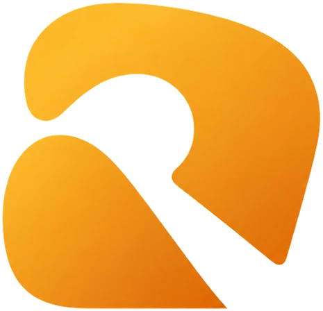
The R and V of my name, brought together in one amber mark.
The problem
One mark had to work at 16 pixels and at full-page scale.
The approach
Let the opening inside the R be the sun in my name.
The result
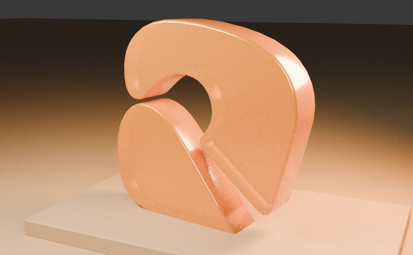
Monogram, palette and sculptural cover used across this site.
The challenge
I wanted a personal mark that works at the size of a browser icon and across a full portfolio cover. It needed a connection to my name that still works as a simple shape.
What I did
Ravi means sun. The counter inside the R carries that meaning without drawing a literal sun, and the rising stroke of the V gives the mark its direction. I took the sunstone idea into an amber palette and gave the mark room to stand on its own.
The decision that shaped it
The opening inside the R is the sun in my name.
A literal sun would have made the mark busy at small sizes. Hiding it in the counter keeps the shape simple and gives people something to discover.
What shipped
The RV monogram, a wordmark lockup, an amber palette and a sculptural cover treatment. The same mark and colours run through this website, from the favicon to the footer.
Anatomy of the mark
A name, drawn.
The work, up close.
 Open full size
 Open full size